Project

Pharmaceutical company
Organosyn

15.08.2017
health
health
health
as a lifestyle
as a lifestyle
as a lifestyle
About customer

pharmaceuticals
to the masses

Organosyn is a pharmaceutical company engaged in the production and marketing of high-quality branded generic drugs. The team and the products that the company brings to the market are its main assets.
task

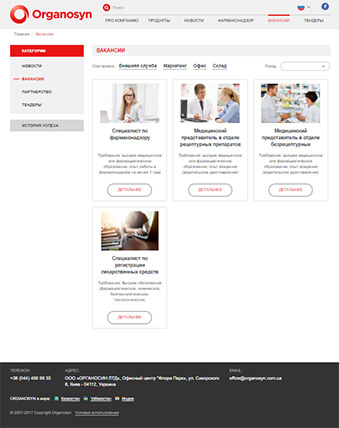
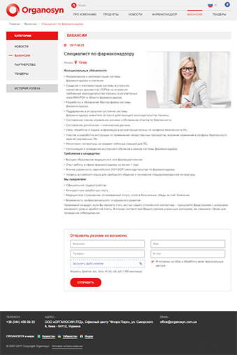
Create an official informational website of the company with a catalog of products, pages of news and vacancies, as well as contact forms for cooperation.

idea

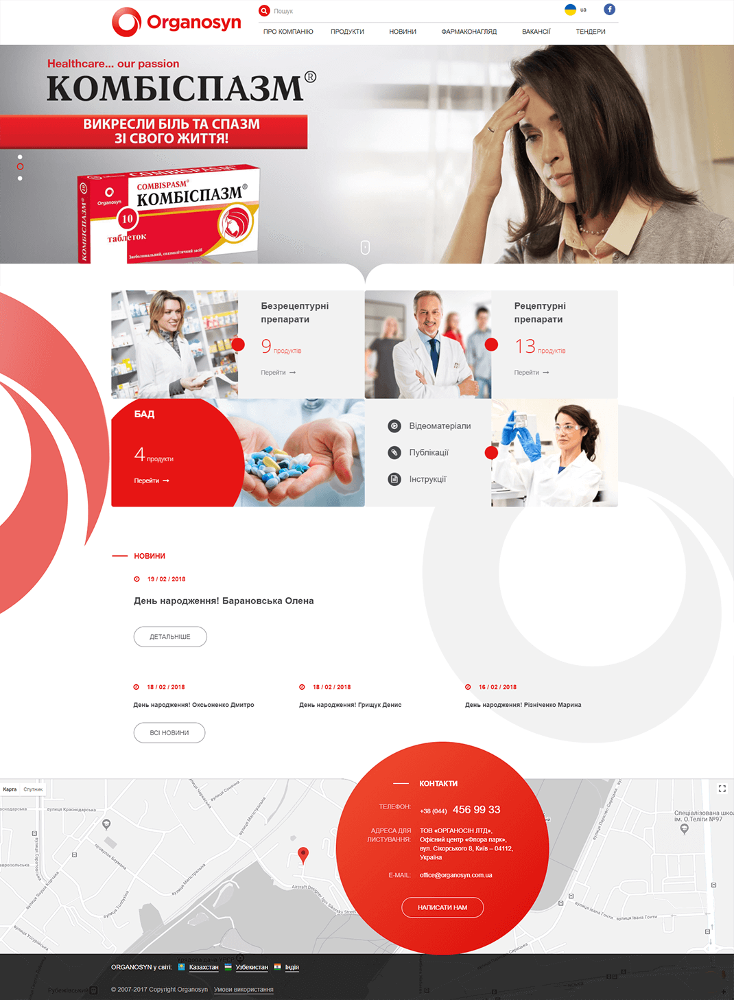
Using the main colors of the company's brand book, which are red and gray, and applying the logo as the main element of the start page design.

Site mission

hit the mark

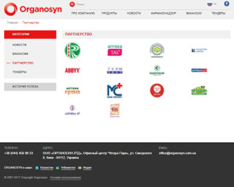
The primary objectives of the site are: to provide high-quality information about the products and services of the Organosyn company, to interest people with company history and achievements, to lure partners and to enrich themselves with promising personnel.

home page

The main entrance of the site does not leave the visitor in doubt that he came to an innovative pharmaceutical company, which has its distinct style. A large banner block and a catalog of animated products create an emphasis on the company's product pride.

non-store
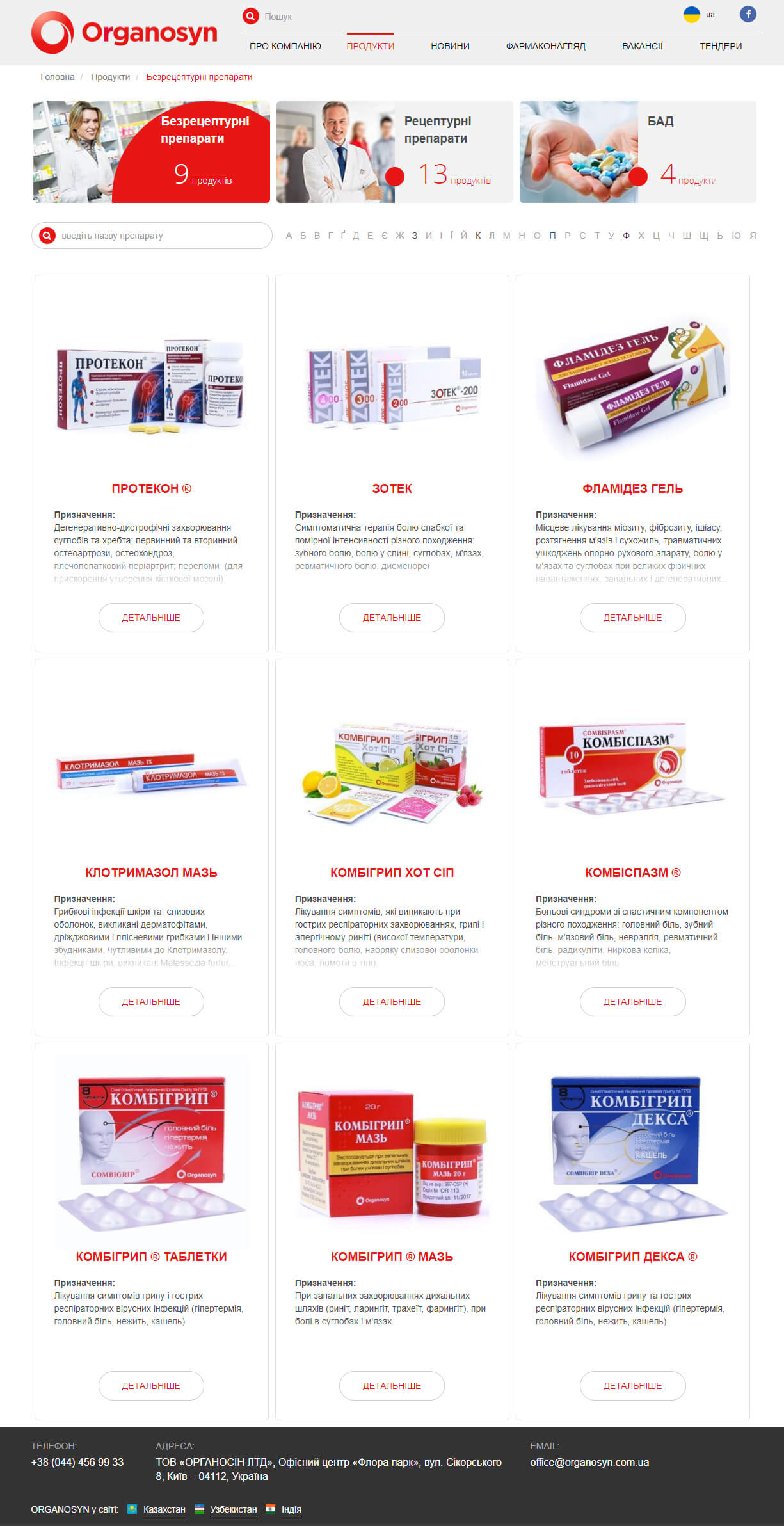
catalog

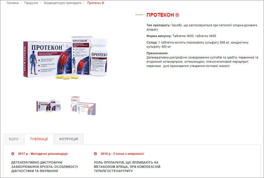
Product catalog of the company is purely informational in its nature. Therefore, it lacks a mechanism for buying goods (tenable!), but there is an alphabetic grouping and a block with publications about the product (admirable!).

When you have something to say

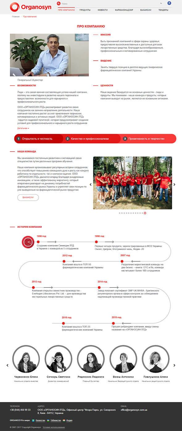
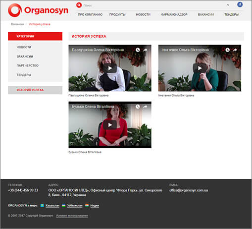
The Organosyn company is proud of its history, its principles and its personnel. The page "About the company" fully and in an accessible form reveals all the trumps of the organization. And to complement the visual presentation of the company there is the video interviews of employees..

Form please

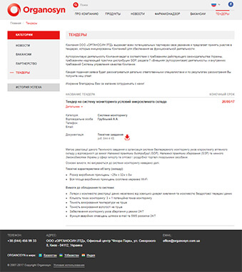
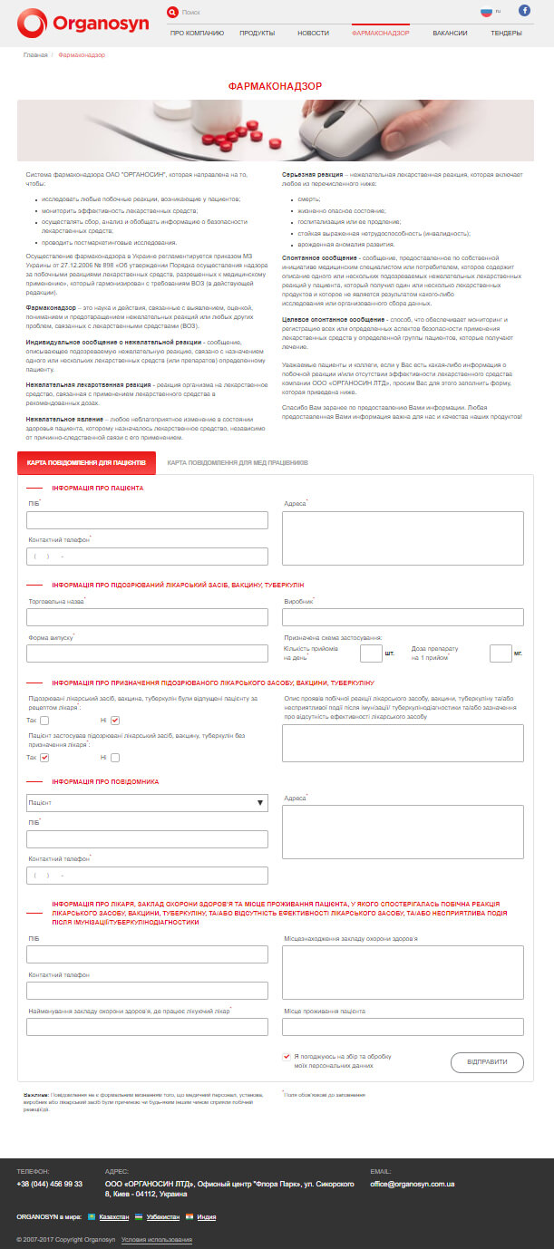
Information pages and contact forms are designed to simplify communication in different areas. Filling out forms are quick and convenient. Everyone loves forms!

adaptability

A huge monitor or smartphone with a small screen? The site always looks good and easy to use, adapting to any device.
Use scrolling to view the entire page.
If you liked the project
then let’s discuss yours!
Get a contact