Project

Online store Easybay

27.11.2018
make your life
make your life
make your life
a little Easier
a little Easier
a little Easier
Initial data

prices + service
= pleasure

Easybay is always a quality service, a large assortment and the best prices on the gadget market. The store has a large selection of the best brands of smartphones and other smart devices. The main goal of the company is to provide customers with the possibility of a quick and convenient purchase at reasonable prices.

task

Make an update of the online store design, reorganize the catalog, expand the functionality of product search and selection, optimize the order processing and tracking system.

idea

Requires a complete redesign of the site and the restructuring of the product base. It is necessary to refresh the design, focus on the best products and optimize the process of finding and making purchases. For this purpose, promotional blocks, a new three-level catalog and an expanded selection system with the withdrawal of related product and stock options will be involved.
Project development

Productive
the choice

The new implementation of the catalog and product base will significantly improve the selection of goods and the ordering process. The user will receive maximum freedom in meeting their needs with new gadgets, and store managers will have the opportunity to increase productivity.

Home page

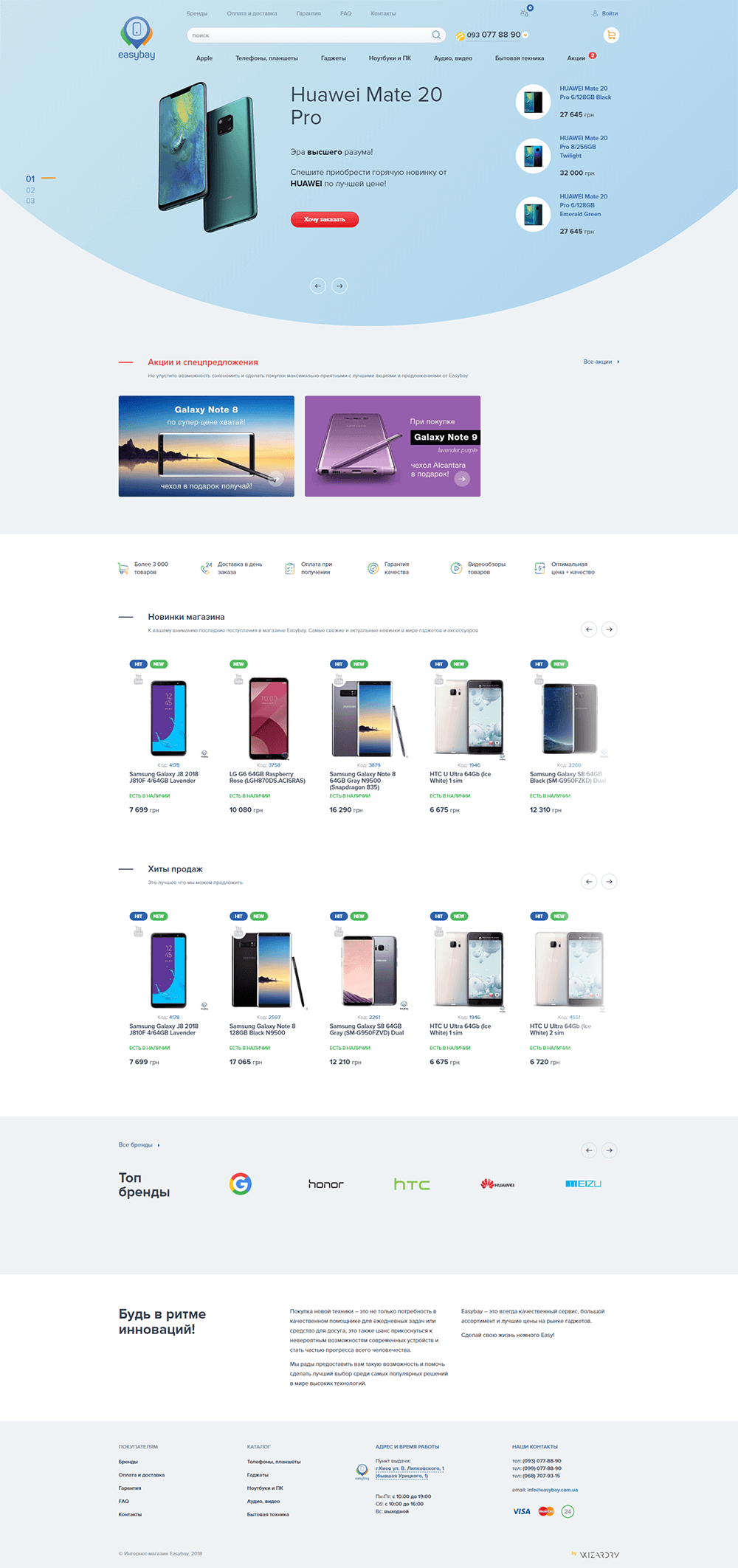
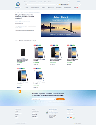
The highlight of the start page has become a large banner block, elements of which come from all sides and immediately draw attention to themselves. The site visitor immediately sees the best offers, news and all the basic information about the store.

Your brand is
your rules

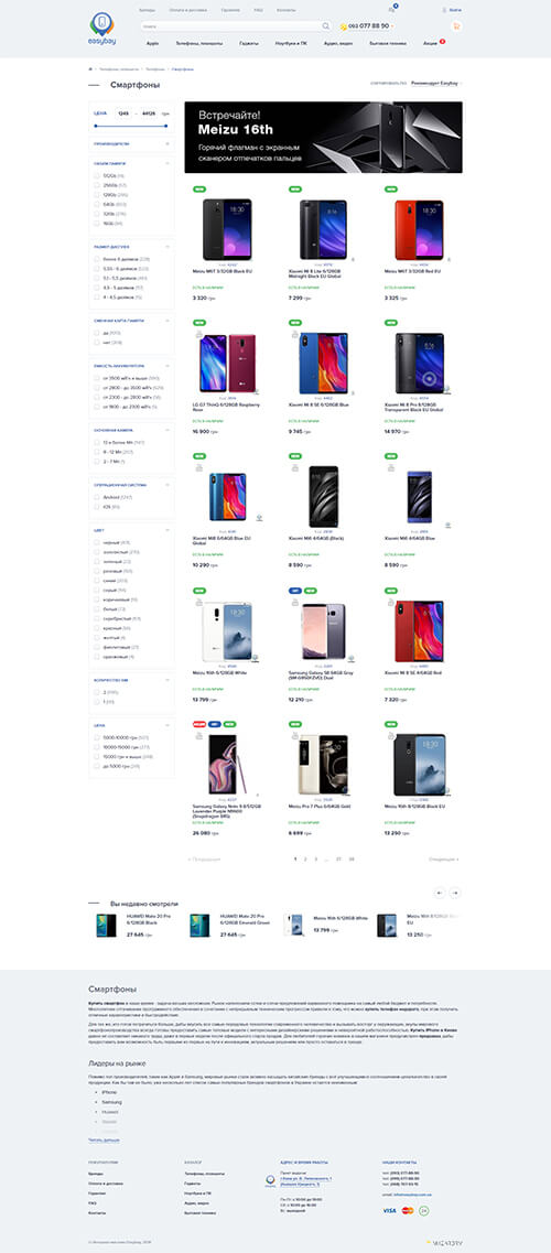
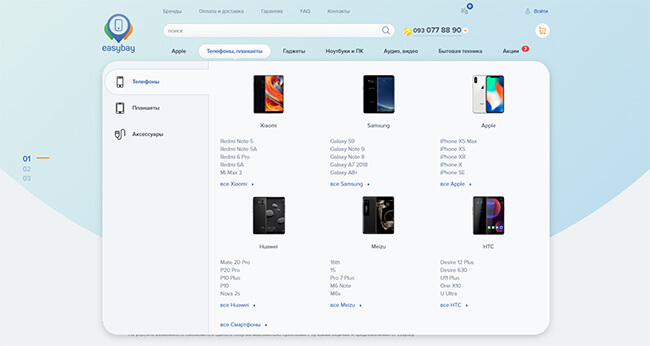
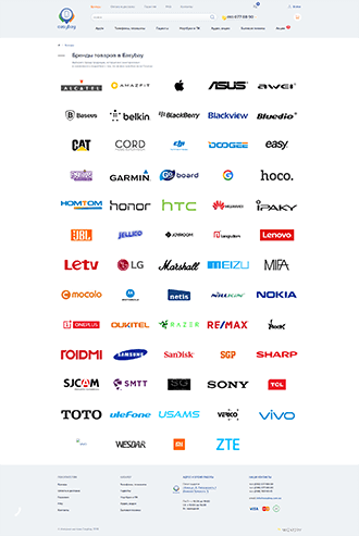
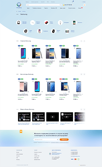
Experienced users of gadgets know exactly who needs more inches, and who needs memory. The menu of the catalog allows you to quickly jump into your favorite brand and quickly find the characteristics of the future pocket pet. Initially, emphasis was placed on filtering and expanding the display of the smartphones section as the base one in the store. But also, provided the opportunity, if necessary, to extend this functionality to any section.

Products with
auto-homing

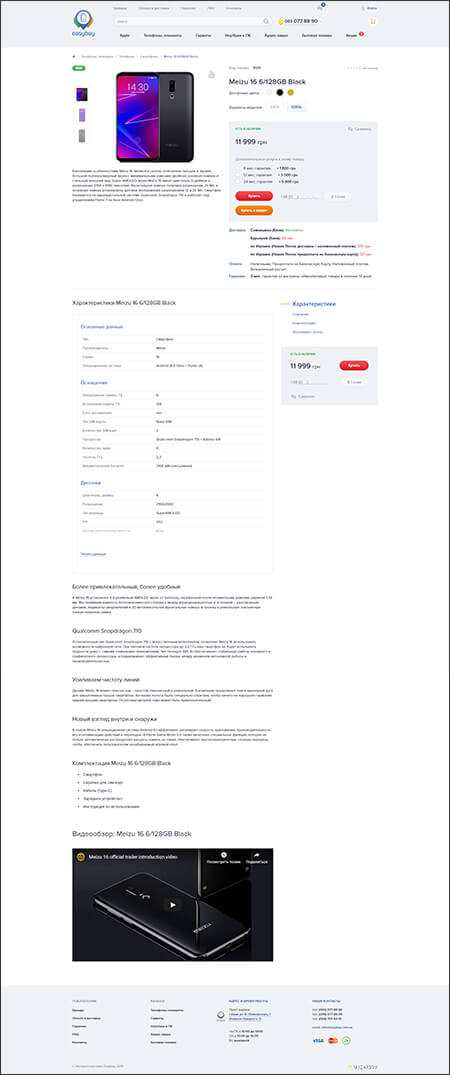
Now, the products of the Easybay store have the opportunity to flaunt a vivid description, a clear table of characteristics with the possibility of comparison, video reviews and links to the brothers in the series. And most importantly, the unit with the function of quick order always runs at hand, while not distracting from acquaintance with the product.

Help
at hand

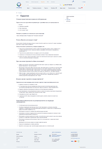
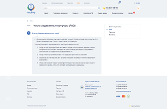
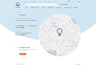
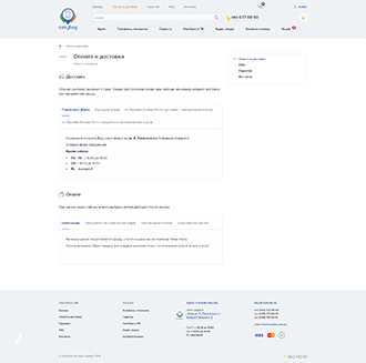
An online store would not be an online store if it did not provide the customer with all the information necessary for a successful purchase. To facilitate the search for the accompanying information, additional pages are called, such as "Payment and delivery", "Guarantee", "Contacts", etc.

adaptability

A huge monitor or smartphone with a small screen? The site always looks good and easy to use, adapting to any device.
Use scrolling to view the entire page.
If you liked the project
then let’s discuss yours!
Get a contact